AD5803 - Book design
- 23 apr 2019
- Tempo di lettura: 4 min
I have finally started putting my book together in InDesign and making a consistent, fluent design.
In the previous weeks, I have decided the ratio of my book and I started looking at similar books that would have helped me to make decisions for the layout. My pictures are a mix of portraits and landscape so I decided to look for a square format but slightly landscape, since the 1:1 ratio looks too bulky in my opinion.


This sort of format looked suitable to me; about the size, I had to make sure that my book would have been big enough to make it easily readable and not overwhelming by the density of text.
After I cut and translated the interviews, I copied and pasted close to the subject's portrait and I started moving it around until it looked visually balanced.
Initially, I was going to place the text in just one column, I was underestimating the difficulty to follow the text when reading long lines, this was a crucial point. Therefore, I definitely had to make two columns.


I think the second version works best, so I took similar solutions for the other subjects as well.
When I had less text, it took a while to find a way to make it looking good. I didn't like to make just one column and leave half blank page, as well as condensing everything in one page only.


So I made two columns again.

The two columns in the middle of the page made the book looking too conceptual and did't fit well with the strictly documentary nature of the text, so I tried to place them in the bottom of the page; a layout that I saw several times in photography books.

I also made sure to have some images to break the sequence. The rhythm portrait-interview-portrait-interview would have been very boring and flat, so I added some full-spread images and stills.


I was afraid that by having all long interviews, the book may ended up being too slow and text-dense, so I have also included some shorter interviews.

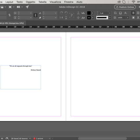
The book will start with a short essay about the figure of the migrant and the series starts and finishes with a quote.
The very last page I want it to be a picture of the beach washed by the sea, and the sea is the subject of the cover as well.
Yesterday I went to take some pictures of the sea with this purpose, I thought it would have been a very straightforward job, but I really underestimated the complexity of the subject. One may think that every picture of the horizon may look pretty similar, but I ended up with hundreds of complete different pictures of the same subject. Every little change in the light, the waves, and the horizon level gives very different results.


I tried different designs for the cover:


I literally have hundreds of similar pictures, put the main choice is between a "crispy" picture of the sea and a very plain ones. I was thinking to use a crispy ones for the cover and a very plain picture for the back, but after I asked for advice I had to revise my choice. Conceptually, it is actually better to use a very plain horizon for the cover because it doesn't bring too much attention on the sea itself, which is not the topic of my book. Furthermore, it gives the impression of uncertainty and a journey to the unknown. On the other hand, for the back, a picture of the waves gives the impression of an endless repetition, like the migration flow.


I prefer the ones in which there is more contrast in the waves, but I am still not sure about where do I prefer the horizon.


I think this is my favourite:

Concerning the back, I tried different options as well.


I tried full spread without the title, but it just doesn't work. I like it plain, but since the end pages are plain as well, there would be too many consecutive blank pages. My favourite option is definitely the first, with a fair thick black border around the image. I am just concerned it looks too much like a front cover, but I have seen many contemporary photography books with this kind of style, and I think it's quite a fashionable thing in the industry nowadays.
Concerning the last pages of the book, as I said, I decided to finish with a quote and then an image of the washed sand/seagulls flying on the sea (trying not to be cheesy).
1 - Option

2 - Option

3 - Option

4 - Option


I really like the quote under the picture, separating the quote and the picture in two different spreads may leave too much empty space, considering the end pages as well.
My last decision is:


So I can include both the seagull and the washed sand; which, conceptually, represents the impossibility to stop the endless motion of the migratory flow.
Commenti